The Importance of Notary Seals and Stamps
Notary seals and stamps play a crucial role in the world of notary public. These official tools are used to validate and authenticate important documents, ensuring their legal integrity. Understanding the significance and legal requirements of notary seals and stamps is essential for both notaries and those seeking notarization.
The Role of Notary Seals and Stamps
The primary role of notary seals and stamps is to serve as an official mark of a notary public. When a notary public affixes their seal or stamp to a document, it signifies that the document has been verified and witnessed by a duly appointed notary. This verification helps prevent fraud and provides a level of assurance to the parties involved.
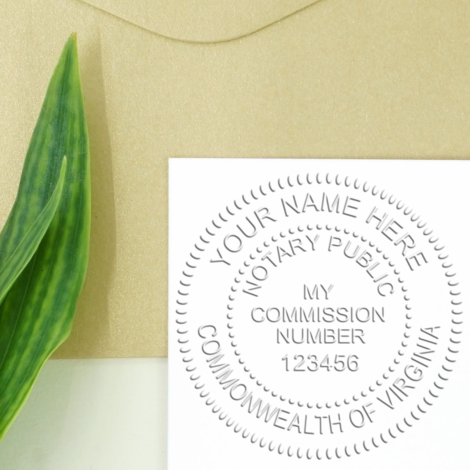
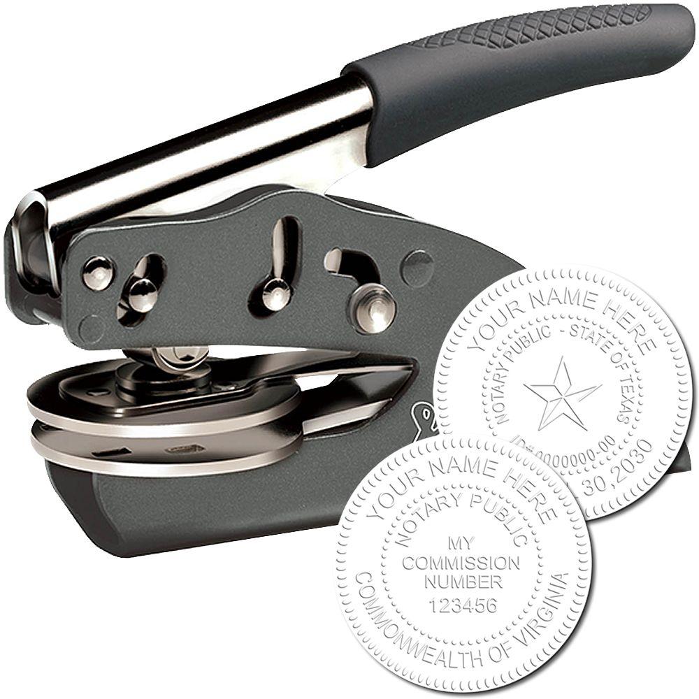
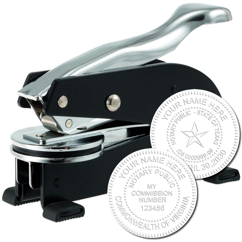
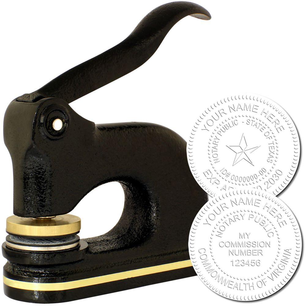
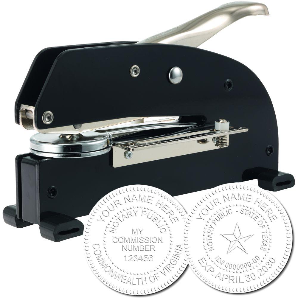
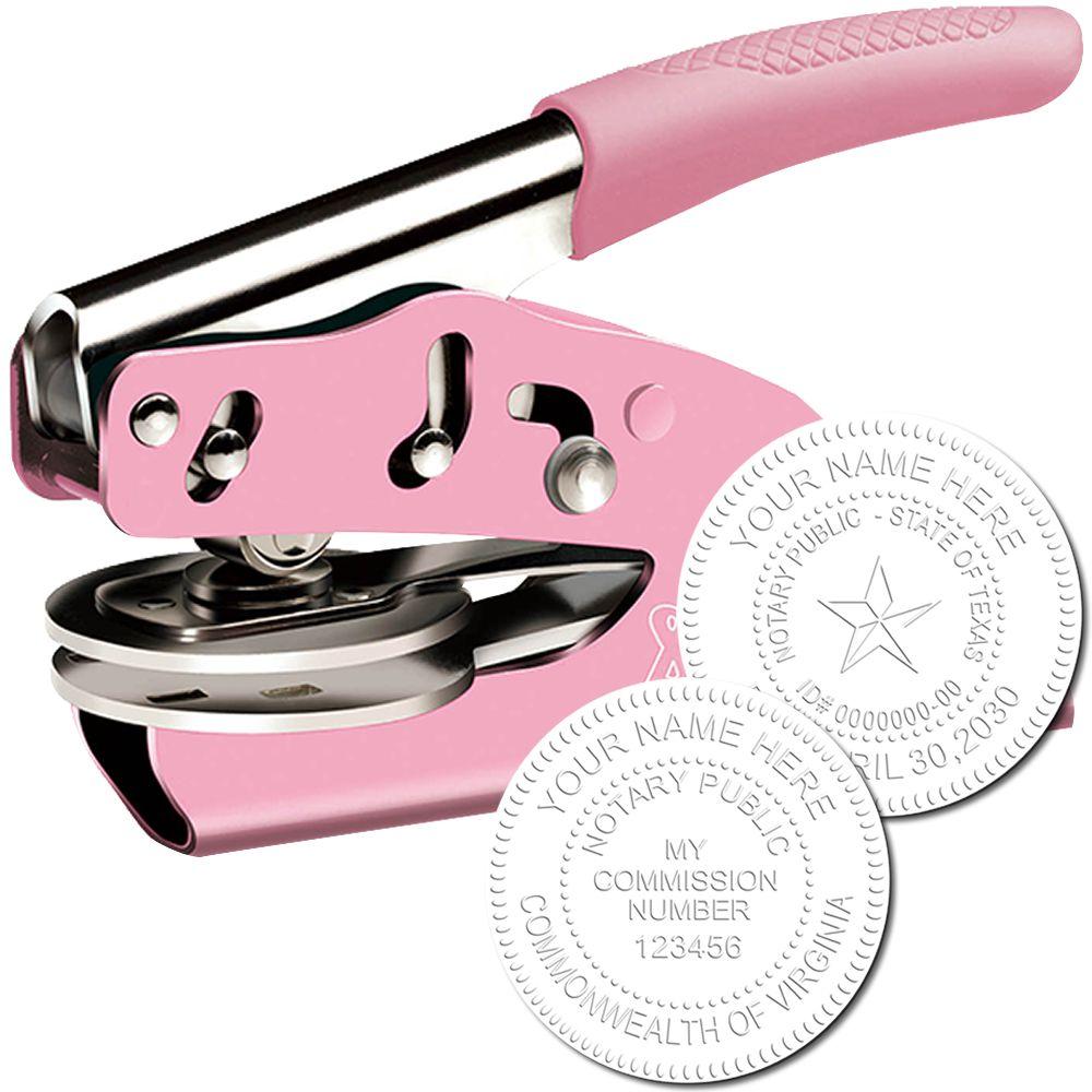
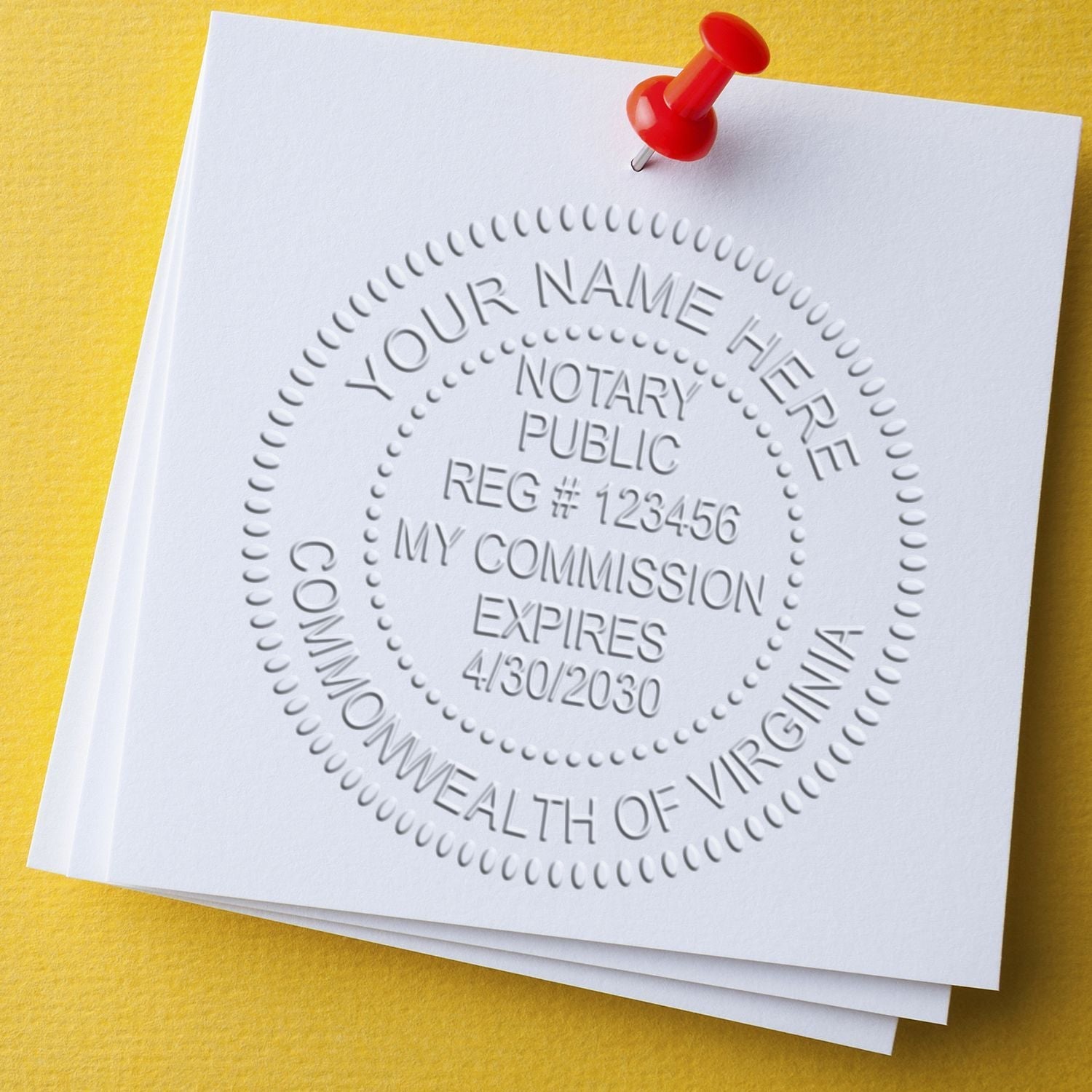
Notary seals and stamps typically include important information such as the notary's name, commission number, commission expiration date, and the jurisdiction in which they are authorized to notarize. This information allows interested parties to verify the authenticity and validity of the notarized document.
Legal Requirements for Notary Seals and Stamps
The specific legal requirements for notary seals and stamps can vary depending on the jurisdiction in which the notary is commissioned. Each state or country may have its own regulations regarding the design, size, and contents of the seal or stamp.
In general, notary seals and stamps must meet certain standards to be considered valid. These standards may include requirements for the size and shape of the seal or stamp, as well as guidelines for the font, spacing, and information to be included. It's essential for notaries to familiarize themselves with the specific requirements set forth by their jurisdiction to ensure compliance.
By adhering to the legal requirements for notary seals and stamps, notaries can maintain the integrity and validity of their notarizations. Additionally, individuals seeking notarization can have confidence in the authenticity of their documents when they see the official seal or stamp of a trusted notary public.
For more information about notary seals and stamps, as well as other aspects of the notarization process, be sure to explore our articles on notary stamps and notary seals.
Understanding Notary Stamp Fonts
When it comes to choosing the right font for your notary stamp, it's important to understand the impact font choice can have on the overall appearance and effectiveness of the stamp. The font you select should convey professionalism, legibility, and alignment with your personal style or branding.
The Impact of Font Choice
The font you choose for your notary stamp can greatly influence how your documents are perceived. A well-chosen font can enhance the credibility and professionalism of the notary seal, while a poorly chosen font can undermine its effectiveness. The font should be clear, easily readable, and appropriate for the purpose of the document.
Legibility is of utmost importance when selecting a font for your notary stamp. The font should be easily readable even when the stamp is applied at a small size. Avoid overly decorative or intricate fonts that may sacrifice readability. It's best to choose a font that strikes a balance between elegance and legibility.
Different Font Styles for Notary Stamps
There are various font styles available for notary stamps, each with its own characteristics and aesthetic appeal. Here are three commonly used font styles for notary stamps:
-
Serif Fonts: Serif fonts, such as Times New Roman or Garamond, are characterized by small decorative lines or strokes at the ends of letters. These fonts are often associated with a more traditional and professional look. They can convey a sense of authority and reliability, making them a popular choice for notary stamps.
-
Sans-serif Fonts: Sans-serif fonts, like Arial or Helvetica, do not have the small decorative lines or strokes at the ends of letters. They are known for their clean and modern appearance. Sans-serif fonts are often chosen for their simplicity and readability, making them suitable for notary stamps that aim for a contemporary or minimalist look.
-
Script Fonts: Script fonts, such as Brush Script or Edwardian Script, mimic the cursive handwriting style. These fonts can add a touch of elegance and sophistication to your notary stamp. However, it's important to select a script font that is still legible when reduced in size. Some script fonts may be difficult to read at smaller sizes or when the stamp impression is not perfectly clear.
When selecting a font for your notary stamp, consider which style best aligns with your personal or professional image. Remember to prioritize legibility and choose a font that will make a clear and lasting impression on your documents.
Understanding the impact of font choice and exploring different font styles can help you select the perfect font for your notary stamp. By choosing a font that combines professionalism, legibility, and alignment with your personal style, you can ensure that your notary stamp makes a strong and professional statement on every document you notarize.
Considerations for Choosing the Right Font
When selecting a font for your notary stamp, it's important to consider several factors to ensure that the chosen font is appropriate and effective. The following considerations should guide your decision-making process: legibility and readability, professionalism and elegance, and alignment with branding and personal style.
Legibility and Readability
The foremost consideration when choosing a font for your notary stamp is its legibility and readability. The font should be clear and easy to read, even when reduced to a small size. This is particularly important as notary stamps often contain important information such as the notary's name, commission number, and expiration date. Opt for a font that has distinct letterforms, well-defined characters, and sufficient spacing between letters to avoid any confusion or misinterpretation.
Professionalism and Elegance
As a notary public, your notary stamp represents your professionalism and serves as a symbol of authority. Therefore, the font you choose should reflect these qualities. Consider fonts that exude a sense of elegance, formality, and professionalism. Classic serif fonts, such as Times New Roman or Garamond, are often favored for their traditional and refined appearance. On the other hand, clean and modern sans-serif fonts, such as Arial or Helvetica, can convey a contemporary and professional image. The font you choose should align with the level of formality and professionalism required in your line of work.
Alignment with Branding and Personal Style
While maintaining professionalism is essential, it's also important to consider your personal style and any existing branding elements. If you have an established personal brand or a logo, you may want to select a font that complements or matches the style of your existing branding materials. This consistency can help reinforce your professional image and create a cohesive visual identity. However, if you do not have an established brand, focus on selecting a font that aligns with your personal style and preferences. Remember, the font choice should be appropriate and consistent with the nature of your work as a notary public.
By considering the legibility and readability, professionalism and elegance, and alignment with branding and personal style, you can choose a font for your notary stamp that effectively represents your authority and professionalism. Remember, the font should be clear, professional, and appropriate for the context in which it will be used.
Popular Font Choices for Notary Stamps
When it comes to selecting a font for your notary stamp, there are several popular choices that can add a professional and polished touch to your documents. Here are three commonly used font styles for notary stamps: serif fonts, sans-serif fonts, and script fonts.
Serif Fonts
Serif fonts are characterized by small decorative lines or strokes, known as serifs, at the end of each letter. These fonts exude a classic and traditional feel, making them a popular choice for notary stamps. The serifs help enhance legibility and readability, especially at smaller sizes.
Some common serif fonts used for notary stamps include Times New Roman, Garamond, and Baskerville. These fonts are known for their elegance and timeless appeal. Serif fonts are often recommended for official documents and legal papers due to their clear and professional appearance.
Sans-serif Fonts
In contrast to serif fonts, sans-serif fonts do not have the decorative strokes at the end of each letter. They offer a clean and modern look, making them a popular choice for contemporary notary stamps. Sans-serif fonts are known for their simplicity and readability, especially at larger sizes.
Popular sans-serif fonts for notary stamps include Arial, Helvetica, and Calibri. These fonts are widely used in various industries and are favored for their clean and straightforward appearance. Sans-serif fonts can give your notary stamp a sleek and professional touch.
Script Fonts
Script fonts mimic the appearance of handwriting, adding a touch of elegance and personalization to your notary stamp. These fonts are characterized by their flowing and cursive-like letterforms. Script fonts can convey a sense of formality and sophistication, making them suitable for certain types of documents.
Some common script fonts used for notary stamps include Edwardian Script, Brush Script, and Lucida Calligraphy. These fonts can add a unique and personal flair to your notary stamp, particularly if you want to convey a sense of individuality and personal style.
When choosing a font for your notary stamp, it's important to consider factors such as legibility, professionalism, and alignment with your personal style. Remember to select a font that is clear and easy to read, even at smaller sizes. Additionally, ensure that the font aligns with your branding and the image you want to portray as a notary public.
By exploring the popular font choices for notary stamps, you can find the one that best suits your needs and enhances the overall presentation of your documents. Remember to test and compare different fonts before making a final decision and seek feedback from trusted individuals to ensure you make the right choice.
Tips for Selecting the Right Notary Stamp Font
When choosing a font for your notary stamp, it's important to consider factors such as legibility, feedback and opinions, and long-term usability. These tips will help you make an informed decision and select a font that best suits your needs.
Test and Compare Fonts
Before making a final decision, it's beneficial to test and compare different fonts for your notary stamp. Experiment with a variety of fonts to see how they appear when stamped on paper. Pay attention to the clarity of the characters and ensure that they are easily readable. Remember, legibility is crucial when it comes to notary stamps, as they need to be easily recognizable and understood by others.
Seek out samples or use online tools to visualize how each font will look in actual use. Comparing fonts side by side will help you determine which option stands out the most and aligns with your preferences.
Seek Feedback and Opinions
Don't hesitate to seek feedback and opinions from others when choosing a font for your notary stamp. Show different font options to colleagues, friends, or family members and ask for their input. They may provide valuable insights and perspectives that you may have overlooked.
Additionally, consider reaching out to other professionals in the notary field for their advice. They may have experience with different fonts and can offer recommendations based on their expertise. Remember to take into account the opinions of others, but ultimately, make a decision that aligns with your personal style and branding.
Consider Long-Term Usability
While it's important to choose a font that looks aesthetically pleasing, it's equally important to consider its long-term usability. Select a font that will remain relevant and timeless, even as design trends evolve. Fonts that are overly decorative or trendy may lose their appeal over time, making your notary stamp appear outdated.
Opt for a clean and professional font that conveys a sense of authority and credibility. Fonts with good readability and a classic appeal are often the best choice for notary stamps. Remember, your notary stamp will be used for official documents, so it's essential to choose a font that stands the test of time.
By following these tips, you can select the right font for your notary stamp that is both visually appealing and functional. Remember, the font you choose will contribute to the overall impression of your notary stamp, so take the time to make an informed decision.
About ESS
At Engineer Seal Stamps, we are rooted in a commitment to excellence, we specialize in crafting custom rubber stamps and premium professional seals. Our intricate designs are not just mere impressions; they are the emblem of precision, meeting the stringent standards approved by the state board. At ESS, we understand the urgency of today's fast-paced world, which is why we prioritize swift shipping without compromising on the quality and finesse of our products. When you choose ESS, you're not just getting a stamp; you're gaining a reliable partner who values your profession as much as you do. Join the community of professionals who won't settle for anything less than the best—choose ESS.

